Monday 5 December 2016

OUGD501 - Study task 04 - Triangulation & Referencing task 

Rave and Its Influence on Art and Culture (Haq, 2016)

Haq, N. (ed.) (2016) Rave: Rave and its influence on art and culture. United Kingdom: Black Dog Publishing.

Relevant key points in summary: 
This book considers the social, political and economic conditions that led to the advent of rave as a 'counterculture' across Europe, as well as its aesthetics, ideologies and influence on contemporary art and beyond. Combining specially commissioned texts, interviews and factual material, the book represents a broad range of artistic practices.

Nowhere left to dance (Finchett-Maddock, 2016)

Finchett-Maddock, L. (2016) Nowhere left to dance: ScumTek, the electronic underground and neoliberal Mainstreamism. Available at: http://criticallegalthinking.com/2016/02/03/nowhere-left-to-dance-scumtek/


Relevant key points in summary:
Article talks about the current rave scene in London and the Scumtek parties, but has a paragraph in which it analyses the marketing used by djs today.

Club Cultures : Music, media and subcultural capital (Thornton, 1995)

Thornton, S. (1995) Club cultures: Music, media and subcultural capital. Oxford, England: Polity Press.

Relevant key points in summary:
This book is a innovative contribution to the study of popular culture, focusing on the youth cultures that revolve around around dance clubs and raves. Using a mix of methods Thornton paints a picture of club as 'taste cultures' brought together by micro media (like flyers and listings) transformed into into self conscious subcultures by niche media (music and style press).

A generation of DJs is skilled in marketing and social media, but not in music production (Trevino, 2015)

Trevino, T. (2015) A generation of DJs is skilled in marketing and social media, but not music production. Available at: https://thump.vice.com/en_us/article/a-generation-of-djs-is-skilled-in-marketing-and-social-media-but-not-music-production

Relevant key points in summary:
Key points from article is a list of techniques used today by djs to improve social media popularity.

500 word triangulation task 

The underground electronic music scene, this genre of music can often feel empty and straight faced due to unrelenting kick drums or atmospheric synths that can be abstract. It can be strenuous to grasp what producers and Dj’s want to say, comparing this to genres like hip-hop or pop, which frequently use lyrics to convey meaning. Therefore its the graphic designers job to convey electronic music in a different light, ‘Well-conceived imagery like Emil Schult's record sleeves for Kraftwerk and Ninja Tune's logo of a cloaked figure hurling a vinyl 12" has become definitive reference points, proving that the way music looks can be just as considered as the way it sounds’ (Trevino, 2015). This quote states that music can be more understood now through how it looks, a graphic designers critical role in this is to signal out a potential audience through the use of visual communication. A new generation of Dj’s are more skilled in marketing and social media than they are in music production or being a professional Dj. Graphic designers can target audiences using ‘obscurantist techniques of branding and lifestyle-marketing that can make millions of people believe the likes of Paris Hilton are consummate audio artists’ (Finchett-Maddock, 2016).

In other cases an audience can come to the artist naturally due to graphic design, instead of using a graphic designer to signal out an audience. For example fashion designer, Walter Van Beirendonck used new beat influenced graphics in his clothing designs which attracted a new beat crowd, then afterwards the house generation and the techno generation. ‘They were really attracted by my variation on the smiley face, and also of course the bright colours and the messages which were on the clothes’ (Haq, 2016). A new audience was reached and his clothes appeared in underground clubs throughout Europe thanks to graphical elements. ‘I used to say that I understood early techno as an international, non-verbal language: without borders, and for which it doesn't matter where your from, if you're black or white, or gay or hetero’ (Haq, 2016). This quote is from Wolfgang Voigt who is an artist, music producer, label owner and one of the co founders of the Cologne based techno label Kompakt. He is known to be responsible for the graphic design, label layouts and logos for
Kompakt and here he is describing the audience of underground music as an open group
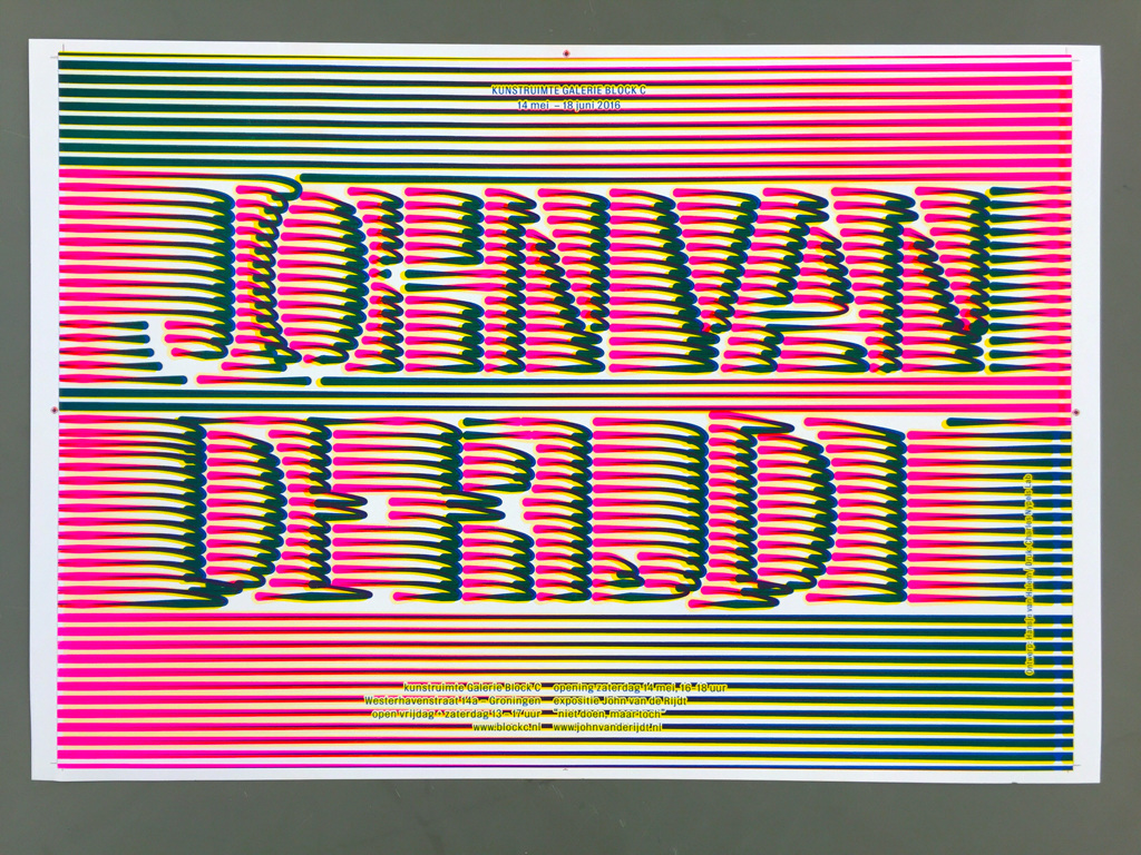
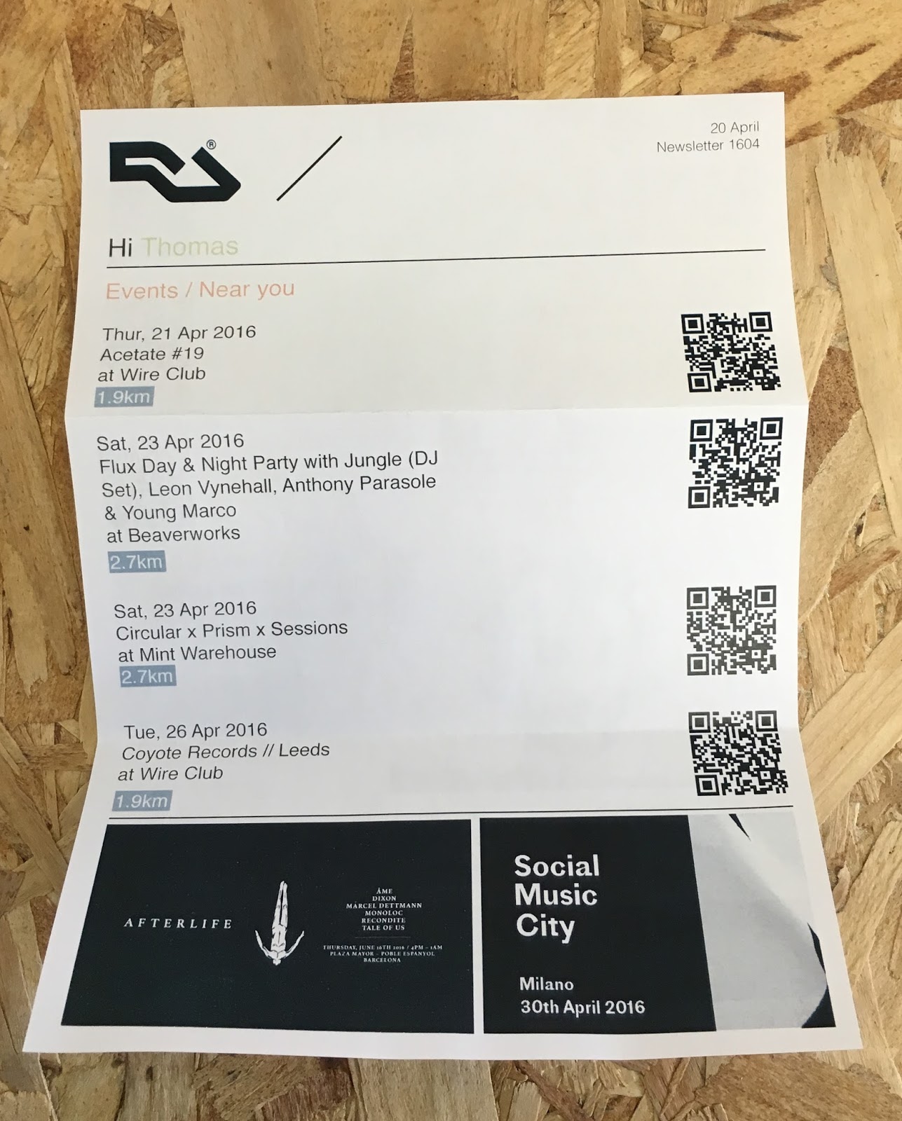
that operates worldwide. However Dj’s and club promoters of today have to single out clubbers, ‘Club crowds are not organic formations which respond mysteriously to some collective unconscious, but people grouped together by intricate networks of communication’ (Thornton, 1995). Flyers and posters are considered the most effective way of attracting a crowd as they can also be relatively inexpensive. Social media is another option in recent years but what exactly is drawing the crowds in? Promoters and Dj’s are using contemporary and well considered graphic design as a means of reaching an audience. Dynamic and ordered design is accomplished using grids and simple typographic approaches to create a clean feel that gives order within, to play with different colours, imagery and shapes. Many clubs are using a smart and structured design approach that provides an insight into what clubbers can expect once inside the club.

Sunday 20 November 2016

OUGD501 - Study task 05 - Practical Research

Contextual research

What rave culture is teaching modern graphic designers
An article talking about how design from 80s and 90s is influencing graphic design today, it gives example of work along with views of this trend that is informing a lot of design, especially in the music industry.

Rave Art
Artwork that was used to promote raves in the 80s and 90s that will later influence the practical final piece. Events that started as secretive nights in underground clubs used rave art, pager and telephonic communication became the medium of message passing, and flyers were key to it all, informing the right people about the right place at the right time.

Academic studies on techno / rave culture
Research into the academic studies of a subculture will inform the practical piece, research on the physical, sociological und cultural aspects of rave culture. Many studies will debunk widely held myths while giving you some food for thought.

A brief history of the Smiley face, rave culture’s most ubiquitous symbol article

#savefabric: The graphic design legacy defining London nightlife article

 Five years worth of Austrian club night posters from studio OrtnerSchinko article

Target audience research

In terms of a geographic audience for the practical work then it could be global but to be specific then the geographic audience would be mainly Germany, Netherlands and Britain because these are the most prominent countries in which electronic music is popular. A demographic age would be generally be people aged between 18-25 years old, this is the typical age group of people who listen to electronic music. Interests of the target audience will be broad such arts, design, fashion and technology but all will have the link of electronic music in particular techno, they will share similar beliefs and opinions on the music genre and class themselves as underground listeners of the genre. This attitude of being independent and underground creates a social group of people who appreciate electronic music, often this is classed as a subculture which is linked to rave but its different in this sense as the music is considered an art form. They value good electronic music highly which lends itself to good design such as album artwork, posters etc linked to the artist.

Target audience persona examples:

Name : Anja Jansen
Gender : Female
Nationally : Dutch
Location : Rotterdam
Age : 26
Occupation : Filmmaker
Interests : Electronic music, Film, Photography and Travel

Name : Hanns Meyer
Gender : Male
Nationally : German
Location : Cologne
Age : 19
Occupation : Graphic design student
Interests : Design, Architecture, Music and Football

Name : Chris Smith
Gender : Male
Nationally : British
Location : London
Age : 38
Occupation : Lecturer
Interests : Business, Food, Music and Technology

Relevant and related visual examples research


French design agency Alles Gut’s work for Laurent Garnier. The semantic relationship of the pop-art imagery and icons relate to rave art from the 80s and 90s and give the artwork meaning and represents a culture. It has a sense of originality through its context and message which a target audience will associate with Garnier, and it doesn't try to emulate previous rave art. The use of bold and striking colour link to the chemically enhanced utopian colours of the rave scene, this simple use of colour is informed and gives the artwork visual language. This work is more parody than pastiche, its been created to comment on rave culture not imitate it.


An example of mainstream graphic design being influenced by possible rave art is the typographic designs for Frank Ocean’s album, Blond. The type is a 21st Century version of rave culture’s off the cuff, cheaply reproduced imagery, utilising lettering warped by repeated scanning, the glyphs morphing into one another, their colours forming a prism of tones. The glitched type is a hyperbole, its used to dramatic effect and the design relies so heavily on such a small use of colour that it steps away from the norm to create a new way of communication.


These graphics are characterised by garish palettes and nods to psychedelia, the application of intense, vibrantly coloured patterns paired with skewed and contemporary type creates a style similar to existing rave artwork from the 80s and 90s. It uses the famous acid smiley face symbol and other elements to create a mash up style that is alike the 'no rules' design of the rave culture, a sense of freedom makes this artwork engaging.


The use of intense, vibrantly coloured patterns was commonly used as an easy visual reference to the experience of raves. The use of vibrant patterns as a signifier in Hanse Van Hansen work is a nod towards the rave aesthetics of hyper density and overlays.


From essay 'The Future Sound which is a club night in Linz, Austria. They have a cohesive poster series with overlapping type and images used in each poster, the designs themselves look disorganised but they are all based on a grid system. The studio behind the posters are OrtnerSchinko ‘The posters are a mix of exposed content on a really strict grid. For us it fits the genre of the club night because the sound is often experimental’ (Liberation®, 2015) says Wolfgang Ortner, the head of design. ‘Often we cut the pictures and the typeface like music samples. The posters are modern, but we distort some elements in a really simple way to create the right tension.’ (Liberation®, 2015) The posters are effective because they don’t always look similar but they are recognisable and have the Future Sound character to them, this is profound evidence that the music of the night informs the design of the posters and proving that the way music looks can be just as considered as the way it sounds'

Monday 7 November 2016

OUGD501 - Study task 03 - Defining the brief

This is the question that will guide my theoretical and practical work in CoP2. My question must reference one of the CoP themes (Politics, Society, Culture, History, Technology or Aesthetics) either broadly or focussing on a specific aspect (e.g. "gender" being a specific aspect of Society); and one specific graphic discipline (Typography / type design, Advertising / public awareness, Branding / logo design, Editorial, Design for screen or Print making).

1. Research question 

For my research I am going to look at the subject of electronic music culture and its influences on art and design. I will look at the past, present and future of the subculture as well as researching current issues surrounding nightlife in the UK today and how these problems may affect art and design in the short and long run. Other research could include how and why designers are trying to recapture 'rave art' in modern graphic design and Fabrics visual identity.  A possible question for my essay could be What is the role of graphic design in the the UK underground electronic music scene ? 

1A. Is it viable

In terms of what there is to study is broad, I can look at the current and present rave culture which leads to the legalisation of nightlife in the UK today and why is Britain turning a blind eye to nightlife culture while Germany and Holland embrace it as a culture. Studying about how rave influenced art and design in the 80s and 90s and how current graphic design is informed by it. Ways in which I can know about it are through books and online resources.

2. Defining the problem

Whilst my research question should provide opportunities for both contextual/theoretical research and practical research, I need to ensure that there is an obvious design problem to resolve/explore. Examples could be that a nightclub needs brand refresh or an electronic music artist requires album artwork that reflects his or her music. Another problem could be to communicate music through design in a different formats.


3. Client needs or requirements 

A specific client could be a nightclub or a rave that needs promotional pieces of work, another client could be an artist who requires artwork.

4. Audience

Audience at this stage is tentative but a possible audiences I could be designing for could be, is youngsters and people interested in electronic music.

5. Mandatory Requirements 

The physical piece of graphic design should be influenced and informed by my essay question and research.


Wednesday 2 November 2016

OUGD501 - Research and Epistemology lecture

This lecture was useful as it helped me think about a way to propose my essay question and introduced me to different ways of researching.

Ontology
The philosophical analysis of what is a fact or can be known, the conceptualisation of existing knowledge that can be known.

Epistemology
The philosophical analysis of the nature of knowledge and how we can know something, these are opinions.

Methodology (approaches)


  • Literature review
  • Case study
  • Action Research


Methodology (Techniques)


  • ·      Interviews
  • ·      Observations
  • ·      Questionares
  • ·      Drawing
  • ·      Making
  • ·      Recording


Methodology (analysis)


  • ·      Theme
  • ·      Frequency
  • ·      Discourse
  • ·      Cross sectional
  • ·      Causal
  • ·      Comparative


Methodology (interpretation)


  • ·      Evaluation
  • ·      Reflection
  • ·      Justification
  • ·      Claims
  • ·      Inferences
  • ·      Application
  • ·      Communication
  • ·      Interpreting our research


Monday 31 October 2016

OUGD501 - Study task 02 - Parody and Pastiche

Having read each of the extracts in the session (Linda Hutcheon - The politics of postmodernism: Parody and history and Frederic Jameson - Postmodernism: Or the cultural logic of late capitalism) For this study task I had to answer questions through a 300 word summary of parody and pastiche according to Jameson and Hutcheon.


In both texts parody and pastiche are defined by both Hutcheon and Jameson in two very contrasting ways. Jameson who is a literary critic and a marxist political theorist, who is best known for his analysis of contemporary cultural trends but also has voiced views on postmodernism. These views include that he believes postmodernity is characterised by pastiche and that pastiche has replaced parody in the postmodern age 'Parody finds itself without a vocation, it has lived and that new thing pastiche slowly comes to take its place' 'Pastiche is thus blank parody, a statue with blind eyeballs'. Jameson strongly puts forward his views on parody and pastiche in his text but on the other hand, Hutcheon talks about how parody in a way is postmodernism, that postmodernist artists are creating a parody of modernism. Hutcheon who is a academic working in the fields of literary theory, criticism and opera, she believes that 'Postmodern parody resembles modernist parody' this contrasts with Jameson who considers such postmodernism as a symptom of the age. Hutcheon states in her text that 'Jameson condemns all Hollywood films as contributing to the problems of late capitalism'. Hutcheon criticises Jameson because she believes you need both parody and pastiche in order to move forward and create something new, and today new innovative work is created which is influenced by work from the past.

These theories relate to design such as the 'Keep calm and carry on' slogan, the endless parodying of the wartime slogan become tedious and tacky but it was first resold in 2001 as a poster but it soon caught on as it appeared on mugs, t-shirts and all other manner of items, and the parody went one step too far when the once motivational wartime quote was humorously reworded into a thousand different variants. 'Keep calm and drink wine' 'Keep calm and go shopping' these are just two examples of a thousand other pointless quotes that degraded the once inspirational and iconic poster.


The example above shows parody and pastiche working as a commentary of a consumer culture. It shows four instantly recognisable logos but manipulates them to communicate a message, the message being, that we live in a consumerist cycle of working to consume.

Monday 17 October 2016

OUGD501 - Study task 01 - Triangulation exercise 

Visual and Other Pleasures 


Mulvey. L (2009 [1975]) Visual and Other Pleasures. Basingstoke


Laura Mulvey is feminist film theorist but also a filmmaker who's work is influenced by Sigmund Freund's psychoanalysis. She's worked for the British Film Institute for many years and currently a professor at the University of London, but her most notable work is the essay 'Visual and Other Pleasures' which helped shift film theory in the 1970s towards psychoanalytical theory. 


Key notes from essay : 

  • How culture reflects society and its structures 
  • Women as an object
  • Patriarchy, men in power within society 
  • Scopophilia, the condition or act of gaining sexual pleasure from openly looking at sex organs or acts
Cultural Theory and Popular Culture

Storey, J (2006) Cultural theory and popular culture. Prentice hall, USA

Key notes from essay :

  • Women are the object of male desire
  • Male gaze
  • Scopophilia
  • Narcism 
  • Two main moments of film, moments of narrative and moments of spectacle 
Heavenly bodies: Film stars and society

Dyer, R. and Department of Film Studies Richard Dyer (1986) Heavenly bodies: Film stars and society. 4th edn. New York: St. Martin’s Press.

Richard Dyer is an English academic currently holding a professorship in the Department of Film Studies at Kings college London. He specialises in cinema, queer theory, and the relationship between entertainment and representations of race, sexuality, and gender.

Key notes from essay :
  • Mulveys freudian thinking leads her to conclude that the male gaze produces a sadistically  voyeuristic pleasure 
  • Male characters are made threatening and aggressive to divert their erotic potential 
  • Men in a scene have to be aggressive towards each other to not promote homosexuality
300 word summary triangulating the 3 texts 

Mulvey, Storey and Dyer all discuss the theory of psychoanalysis and gender roles within film in their  essays, the later two being mainly influenced by Mulvey's Visual and Other Pleasures which helped shift film theory in the 1970s towards psychoanalytical theory. Mulvey who is a feminist film theorist talks about numerous points, mainly bombarding the film industry with the first being women as an object in film. "In a world ordered by sexual imbalance, pleasure in looking has been split between active/male and passive/female" (Mulvey 2009 [1975]:19). This point has also been in Cultural Theory and Popular Culture by John Storey, Mulvey stating "men look and women exhibit 'to-be-looked-at-ness' - both playing to and signifying male desire"  Mulvey expresses her personal views on this as its apparent she is unhappy with the way women are being sexualised in film but on the other hand Dyer's view is the opposite. Dyer who  specialises in cinema, queer theory, and the relationship between entertainment and representations of race, sexuality, and gender, discuses how the male body can also be displayed and objectified on film the same way as a woman is. He goes on to show an example from the film 'Picnic' in which a male actor is gazed at when topless on screen. 

Monday 25 April 2016

OUGD401
Evaluation

To conclude on this module which at times I've found challenging but in the end very helpful to my practice. Learning ways of research and exploring the historical and contextual side of graphic design, then bringing theory into practice in the practical work has been parts I've enjoyed. I'm happy with my essay as Ive came to understand new theories about my essay question which was 'the role of print media in the digital age', learning these theories has helped me forge a comprehension of what print media is today within my subject discipline; and helped me consider paths I may want to take in print media as I'm interested in editorial design.

Ive been pleased with my research in this module as it been to relevant and current to my essay but also my discipline, Ive come to understand graphic design more contextually in this module which I'm pleased with. The research informed my essay along with my practical piece and I'm pleased how both turned out.

Lectures and seminars have been important in helping me gain an understanding but also making assumptions / opinions of my discipline for myself. Learning about theories and methods in these lectures has benefited other modules such as design principles in which I've been able to apply certain methods etc to my work. At the start of this module I wanted to further my knowledge of graphic design and improve my critical writing and now the module is at a end, I believe I've achieved these aims through my essay feedback and my research for the essay; which has helped improve my theory of graphic design.
OUGD401
Practical Exploration - Final & Testing

For my final outcome I wanted to test the newsletter using a QR Scanner to see if the newsletter is effective. The scanner instantly links the newsletter to the website for functionality. To see if it is effective and relevant to the brief, I targeted people who usually use or who are aware of Resident Advisor; to gather feedback. The first question I asked was:

Would you be more encouraged to buy tickets after receiving a printed newsletter ?

'Yes I'd feel more inclined to purchase a ticket if I was personally sent a newsletter, its a sense of being involved / first to know basis'

'I'd certainly be more interested in the event if I was informed. Normally I skip past adverts about events etc online, but being presented the information through printed media creates a different expeirence'

'I think having the printed newsletter as a tangible object would certainly persuade you to consider buying from the QR code, because its something you can easily return to unlike an online page you skip through mainly because of the adverts'

Would the personalised touches of 'Hi' and 'Events near you' create a different experience ?

'From my own experience of the RA website you can access events near you and If you have an account it welcomes you to the page. Not much printed media is personalised today like you've done for the newsletter so I would say it creates an experience that helps customer trust'

'I like how the 'Hi' welcomes you to the newsletter, just using simple relaxed language can make the viewer interested'

'I feel like the whole point of this newsletter is to create a connection between customer and brand through printed media so the inclusion of personalised touches such as 'Hi' and 'Events near you' helps this'


The feedback was positive and helpful as my resolution to the brief was recognised as connecting the customer to the brand through printed media,and also the mixture of printed media and digital through QR codes. It was interesting to see people more interested in printed media than the website mainly down to adverts but people also liked the idea of the newsletter being a first to know newsletter.  


OUGD401
Practical Exploration - Production & Final

The first part of final production was a small envelope I designed, I wanted to include this as a mockup for submission. Using a simple template for the net of the envelope then adding Resident Advisors logo. The final came out as planned, I printed on 80 gsm standard white stock for the a desired newsletter style.


The newsletter has three headers:
-Events near you
-Events / Popular
-News

The layout is rather simple, with the content flowing down the page but the most crucial information is the QR codes which are clearly visible.

Sunday 24 April 2016

OUGD401
Practical Exploration - Development & Production

In development I mocked up the newsletter in Illustrator, experimenting with different layouts. The main information being presented first so the viewer is informed, the order of the newsletter is the content aimed at the customer first, for example the events nearby then popular events, followed by generic news.

I decided to produce the newsletter in Illustrator because I found it easier to mock up and experiment with the objects and content, even though Indesign may have presented a better layout guide to follow. I used QR Generator which is website which simply allows you to create QR codes ready to scan so the QR codes on the newsletter take you straight to the events page on the Resident Advisor website. Adverts are located at the bottom of the page, in my essay I discuss how people trust printed media because they aren't saturated in online adverts but for the newsletter I include adverts as another format of news.
OUGD401
Essay - Feedback

Feedback from tutor - A solid submission that has research which is current and relevant that supports my argument but I need to fully establish the argument. Weaknesses include, paragraphs need shortened and add images as the essay needs two images included, these images could be the Ikea catalogue I talk about or the NHS newsletters.

Improvements to be made - In editing I needed to shorten the paragraphs and edit the runs ons, the introduction and conclusion also needed slightly edited to help introduce and summaries my argument. The inclusion of images is also a improvement I needed to make to help support certain points I was making in the essay.

Thursday 21 April 2016

OUGD401
Practical Exploration - Initial ideas


Above is my initial sketch for the layout of the newsletter, the graphic style was primarily based of Resident Advisors branding but in the initial sketches I wanted to focus on the layout and how the customer would view the newsletter. The newsletter welcomes in the viewer with a personalised touch then shows the events based on their location, the QR codes are clearly visible for the customer, the addition of adverts will be on the newsletter, I was wary to include them as people are often saturated of adverts online and find print media are more relaxing experience. The newsletter also includes events that are popular and news related to you. In sketch form I included a calendar to show your upcoming events but this may seem obsolete. The newsletter is 21cm x 28.5 so it can fit in a standard envelope if folded in 3 folds.

Feedback on initial sketches is that the newsletter is very customer orientated, 'Using hi welcomes the viewer and encourages a customers / brand relationship I think' 'The QR codes are a clever way of linking the newsletter with the website, and makes the customer more interested I think'


Wednesday 20 April 2016

OUGD401
Practical Exploration

As my newsletter will use a QR code to link printed media with digital I found it necessary to research more into QR codes, A QR code consists of black dots arranged in a square grid on a white background, which can be read by an imaging device such as a camera and processed until the image can be appropriately interpreted. They've become common in consumer advertising. Typically, a smartphone is used as a QR code scanner, displaying the code and converting it to some useful form. QR code has become a focus of advertising strategy, since it provides a way to access a brand's website more quickly than by manually entering a URL. Beyond mere convenience to the consumer, the importance of this capability is that it increases the chance that contact with the advertisement will convert to a sale, by coaxing interested prospects with little delay or effort, bringing the viewer to the advertiser's website immediately, where a longer and more targeted sales pitch may lose the viewer's interest. The promise of QR Codes, as presented to potential clients, is irresistible. In print space is limited. Whether it is a company brochure or a bus stop ad, there’s a defined amount of space to communicate your message. Beyond this, your message is typically static and has no interaction with the customer. With the web though, everything changes. Space is virtually unlimited, interaction capabilities are limited only by your imagination and marketing becomes possible with technologies like social media: sustained, continual customer contact.


Above is way Guinness interacted with customers using QR codes, the code was located on a pint glass to improve the experience and offer a little something more, the QR code takes you to the Instagram page to help spread social media awareness for Guinness.  What I like about this QR code is that, it is only activated once a liquid is in the glass. It is barely visible to the viewer when its empty.

Tuesday 19 April 2016

OUGD401
Practical Exploration

'Be Clear on Cancer' print ad delivers a 62% response from target audience'


The anxieties surrounding cancer often prevent people from seeking medical help, so Public Health England decide to be more upfront with people with its 'Be Clear on Cancer' campaign. The campaign was an initiative designed to influence those with possible cancer symptoms to seek help faster and was rolled out in print as well as radio to reach as many of the target audience as possible. Markeing Director of Public Health England says "This was a real opportunity to make a difference to peoples lives. For the first time we were proposing to use mass media to encourage people to go and see their doctor about cancer symptoms". Since the campaign, there has been a 62% and 29% increase in patients aged over 50 visiting their GP about the symptoms highlighted in the lung and bowel cancer campaigns respectively, whilst during the same time the rise of visits to GPs with symptoms not directly featured in the campaign rose by a maximum of 4%.

This case study proves printed media used to target an audience encouraged people to visit GP's. Whether this shows people trust printed media or feel more involved due to being sent a newsletter, it provokes a response.
OUGD401
Practical Exploration

"IKEA boosts the number of social media followers by engaging their audience with...print"

IKEA has already established its position as the 'go to' ready-to-assemble furniture retailer, strongly aided by their annual IKEA catalogue- the main marketing tool for the brand, with 70% of the annual budget dedicated to producing it. To push social media activity using the catalogue release as a starter, IKEA implemented a completely cost free solution to get their online followers buzzing. In Norway, every household receives an IKEA catalog, so brand decided to integrate their existing marketing channel in a new way. The idea was to get people talking about the new product range and spread the content online: IKEA encouraged its social media followers on Facebook and Instagram to snap pictures of furniture items on the pages of the catalogue, and post them under the hashtag #ikeakatalogen along with the item's name. As an added incentive, every week, IKEA would give away an item to one of the users who uploaded the image online. Within just four weeks, the campaign was able to successfully recreate IKEA's print catalog online, after every item in the catalog had been photographed and uploaded. IKEA Norway dramatically increased social media following and engagement, especially on Instagram, where it went from having 0 to 12,000 followers. The campaign execution cost IKEA a few products and 0% of their annual marketing activity budget.

This campaign shows that printed media working alongside digital formats such Instagram and Facebook engages the user more. This could be similar to the QR codes used in my newsletter, the mix of print and digital working together as a marketing tool.
OUGD401
Practical Exploration

I felt it was necessary to research more into Resident Advsior to see which content could possibly be communicated in the newsletter. Below is an example of the events page online, this would be presented on a newsletter with the QR code opposite to take you to Resident Advisors website, the events would altered around your past events, for example a certain events space you've frequently visited which RA knows through 'my orders'. On the app it shows 'favourites', 'near me', 'popular' and 'all', for the newsletter It would show events targeted for you, so most definitely 'near you' and possibly popular events in the area.


Below is the Resident Advisor email newsletter, it simply tells members of the latest electronic music news but nothing they couldn't check on the website. The printed newsletter would be designed around the needs of the customer and not information that may be irrelevant to them.


OUGD401
Practical Exploration

As my essay question is 'what is the role of print media in the digital age ?' I needed to consider the role of the newsletter I was producing, its first role is to bring the customer and the brand closer through printed media, in my essay I discuss how customers feel more attached to a brand through printed media and I think this will be achieved in my practical piece. The second role is to target an audience that you can't do online, by targeting an audience you receive a better reaction. The last role would be to bring the brand into printed media, having both an online and printed platform for RA can benefit the brand.
OUGD401
Practical Exploration

To develop my idea I looked at printed newsletters to see what is commonly used and what is communicated. I looked at varied newsletters, which different target audiences.


Above is a newsletter for Standard Chartered, I believe this newsletter is highlighting the banks achievements to inform the customer of how its doing. Statistics and figures cover the first page to show growth then interviews, which I presume are to make the customer feel more involved in their bank.


Above is an example of an NHS newsletter that I discuss in my essay, this one is targeted towards the people of South Gloucestershire, telling them about a new campaign and urging them to seek help and advice if needed. These newsletters have a high success rate, as patient levels rise normally when NHS send printed newsletters out. The way I could measure the success of the newsletter for RA could be the amount of ticket sales through the scan codes.
OUGD401
Practical exploration - Intial thoughts

My essay was about the role of print media in the digital age and in the essay I talk about the relevance of certain printed media today such as the indie magazine and newsletters and ways businesses still use printed media to their advantage. After analysing numerous sources It was clear businesses use print media for a target audience, marketing campaigns specifically aimed towards certain age groups or certain tastes, that people tend to pass around such as newsletters to spread the word. A digital side is incorporated within these newsletters and catalogs, the use of QR codes and hashtags, links printed and digital to give businesses more exposure.

Following on from these facts from my essay, my thoughts for the practical exploration were to produce a newsletter that is specifically aimed towards a certain group, the newsletter would inform a subject related to the needs and wants of the user, people tend to feel more connected with a brand / business through printed media so this would be a aim of the newsletter. It would also include QR codes to interlink with the digital age.

I had the idea of producing a newsletter for a specific target audience but I needed to consider who the audience would be and which business / brand. A few examples I thought of were Ikea, I considered Ikea because in my essay I look at how Ikea used a printed catalog to enhance social media followers on Instagram. Producing a newsletter for Ikea would be hard to target an audience I thought, as you don't know specific tastes. H&M was another consideration, the newsletter would inform the viewer of latest products then include a QR code so they can possibly purchase the product but I felt a newsletter for H&M would be too similar to a catalog. I then settled on the idea of producing a newsletter for Resident Advisor which is one of the world's largest independent electronic online music magazines. News, interviews, and reviews. The first reason I picked RA is because in my essay I discuss how magazines ditched printed media and decided to go digital, but for my practical piece I do the opposite and have a digital magazine go printed. 

The second point is, Resident Advisor is also a ticket seller so this is a way of targeting an audience, information on the latest events in your area will be included in the newsletter with a scan code to buy tickets. The newsletter would be sent to members of RA, to be a member you simply have to buy a ticket online anyway. With RA having a newsletter it informs the audience of events nearby, personally I think this enhances the customer and brand relationship through printed media. Other aspects of the newsletter could be news relating past events youve attended or news about your favourite act / artist as RA can judge by online.

Wednesday 30 March 2016

OUGD401
Establishing the requirements of my practical investigation

What is the role of print media in the digital age ?

Technique :

- Digital print methods
-  Printed newslettter style

Content

- Target audience content / specific events judged on your account
- Scan codes for digtial link
- Content from main RA website

Communication / Message

- Informing targeted audience of events nearby

Research analysis

- Essay
- RA website
- Studies proving printed newsletters reach target audiences

Exploration / Evaluation

- Explore diffrent types of newsletters

Testing

- Feedback
- Compare digital newsletter to printed newsletter

Monday 14 March 2016

OUGD401
Planning and structuring an essay

'The role of print media in the digital age'

References used:
Jamieson, R, 2015, ‘Print is dead. Or is it?’, The slow journalism company,

Smith, R, 2015, ‘Why a new wave of independent magazines are thriving’,

Newtek, 2012, 'Print is dead? not so fast.’, Forbes

Plan:

P1: Print is dead or is it ? debate and the rise of independent magazines
P2: Mix of traditional and digital print working together
P3: Relationships between print media and companies 
P4: Tradtional methods in the digital age
OUGD401
Finding research sources

Our task in this session was to find four sources defining the definition of branding. As a group we found four sources online and the following definitions are below:

'A particular identity or image regarded as an asset' (Oxford Dictionaries)
The main reason why Oxford Dictionaries' website is a trustworthy is because they are known for making dictionaries for over 100 years."More than 250 language specialists research the language as it changes and develops every day" which proves that it is updated to ensure it is as accurate as possible.

'A trademark or distinctive name identifying a product or a manufacturer'(Definition.org)
Domains that end in '.org' are very reliable source as their content is monitored and edited on a regular basis.

'Branding is convincing that voice in someone's head to be on your side'(The School of Visual Arts - Veronica Parker-Hahn)
One thing that made this definition seem viable was how The School of Visual Art refer to themselves on their website as the 'Masters In Branding'.

'Taking a piece of $hi* and spray painting it.' (Urban Dictionary)
This is a example of an unreliable source as proven with the definition. Urban
 Dictionary do not have accurate definitions and are instead definitions based more around humour

This task proved that not everything online is trustworthy to refer to but the vast amount of sources available online is incredibly useful.