Contextual research
What rave culture is teaching modern graphic designers
An article talking about how design from 80s and 90s is influencing graphic design today, it gives example of work along with views of this trend that is informing a lot of design, especially in the music industry.
Rave Art
Artwork that was used to promote raves in the 80s and 90s that will later influence the practical final piece. Events that started as secretive nights in underground clubs used rave art, pager and telephonic communication became the medium of message passing, and flyers were key to it all, informing the right people about the right place at the right time.
Academic studies on techno / rave culture
Research into the academic studies of a subculture will inform the practical piece, research on the physical, sociological und cultural aspects of rave culture. Many studies will debunk widely held myths while giving you some food for thought.
A brief history of the Smiley face, rave culture’s most ubiquitous symbol article
#savefabric: The graphic design legacy defining London nightlife article
Five years worth of Austrian club night posters from studio OrtnerSchinko article
Target audience research
In terms of a geographic audience for the practical work then it could be global but to be specific then the geographic audience would be mainly Germany, Netherlands and Britain because these are the most prominent countries in which electronic music is popular. A demographic age would be generally be people aged between 18-25 years old, this is the typical age group of people who listen to electronic music. Interests of the target audience will be broad such arts, design, fashion and technology but all will have the link of electronic music in particular techno, they will share similar beliefs and opinions on the music genre and class themselves as underground listeners of the genre. This attitude of being independent and underground creates a social group of people who appreciate electronic music, often this is classed as a subculture which is linked to rave but its different in this sense as the music is considered an art form. They value good electronic music highly which lends itself to good design such as album artwork, posters etc linked to the artist.
Target audience persona examples:
Name : Anja Jansen
Gender : Female
Nationally : Dutch
Location : Rotterdam
Age : 26
Occupation : Filmmaker
Interests : Electronic music, Film, Photography and Travel
Name : Hanns Meyer
Gender : Male
Nationally : German
Location : Cologne
Age : 19
Occupation : Graphic design student
Interests : Design, Architecture, Music and Football
Name : Chris Smith
Gender : Male
Nationally : British
Location : London
Age : 38
Occupation : Lecturer
Interests : Business, Food, Music and Technology
Relevant and related visual examples research

French design agency Alles Gut’s work for Laurent Garnier. The semantic relationship of the pop-art imagery and icons relate to rave art from the 80s and 90s and give the artwork meaning and represents a culture. It has a sense of originality through its context and message which a target audience will associate with Garnier, and it doesn't try to emulate previous rave art. The use of bold and striking colour link to the chemically enhanced utopian colours of the rave scene, this simple use of colour is informed and gives the artwork visual language. This work is more parody than pastiche, its been created to comment on rave culture not imitate it.

An example of mainstream graphic design being influenced by possible rave art is the typographic designs for Frank Ocean’s album, Blond. The type is a 21st Century version of rave culture’s off the cuff, cheaply reproduced imagery, utilising lettering warped by repeated scanning, the glyphs morphing into one another, their colours forming a prism of tones. The glitched type is a hyperbole, its used to dramatic effect and the design relies so heavily on such a small use of colour that it steps away from the norm to create a new way of communication.

These graphics are characterised by garish palettes and nods to psychedelia, the application of intense, vibrantly coloured patterns paired with skewed and contemporary type creates a style similar to existing rave artwork from the 80s and 90s. It uses the famous acid smiley face symbol and other elements to create a mash up style that is alike the 'no rules' design of the rave culture, a sense of freedom makes this artwork engaging.
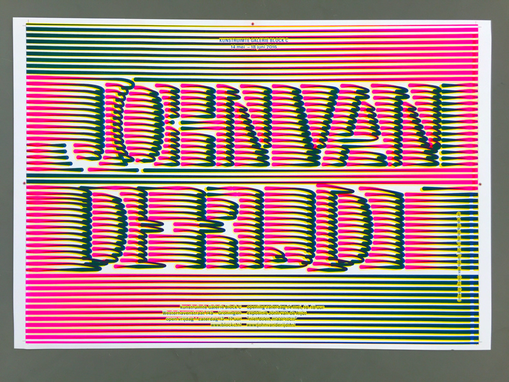
The use of intense, vibrantly coloured patterns was commonly used as an easy visual reference to the experience of raves. The use of vibrant patterns as a signifier in Hanse Van Hansen work is a nod towards the rave aesthetics of hyper density and overlays.

From essay 'The Future Sound which is a club night in Linz, Austria. They have a cohesive poster series with overlapping type and images used in each poster, the designs themselves look disorganised but they are all based on a grid system. The studio behind the posters are OrtnerSchinko ‘The posters are a mix of exposed content on a really strict grid. For us it fits the genre of the club night because the sound is often experimental’ (Liberation®, 2015) says Wolfgang Ortner, the head of design. ‘Often we cut the pictures and the typeface like music samples. The posters are modern, but we distort some elements in a really simple way to create the right tension.’ (Liberation®, 2015) The posters are effective because they don’t always look similar but they are recognisable and have the Future Sound character to them, this is profound evidence that the music of the night informs the design of the posters and proving that the way music looks can be just as considered as the way it sounds'
No comments:
Post a Comment