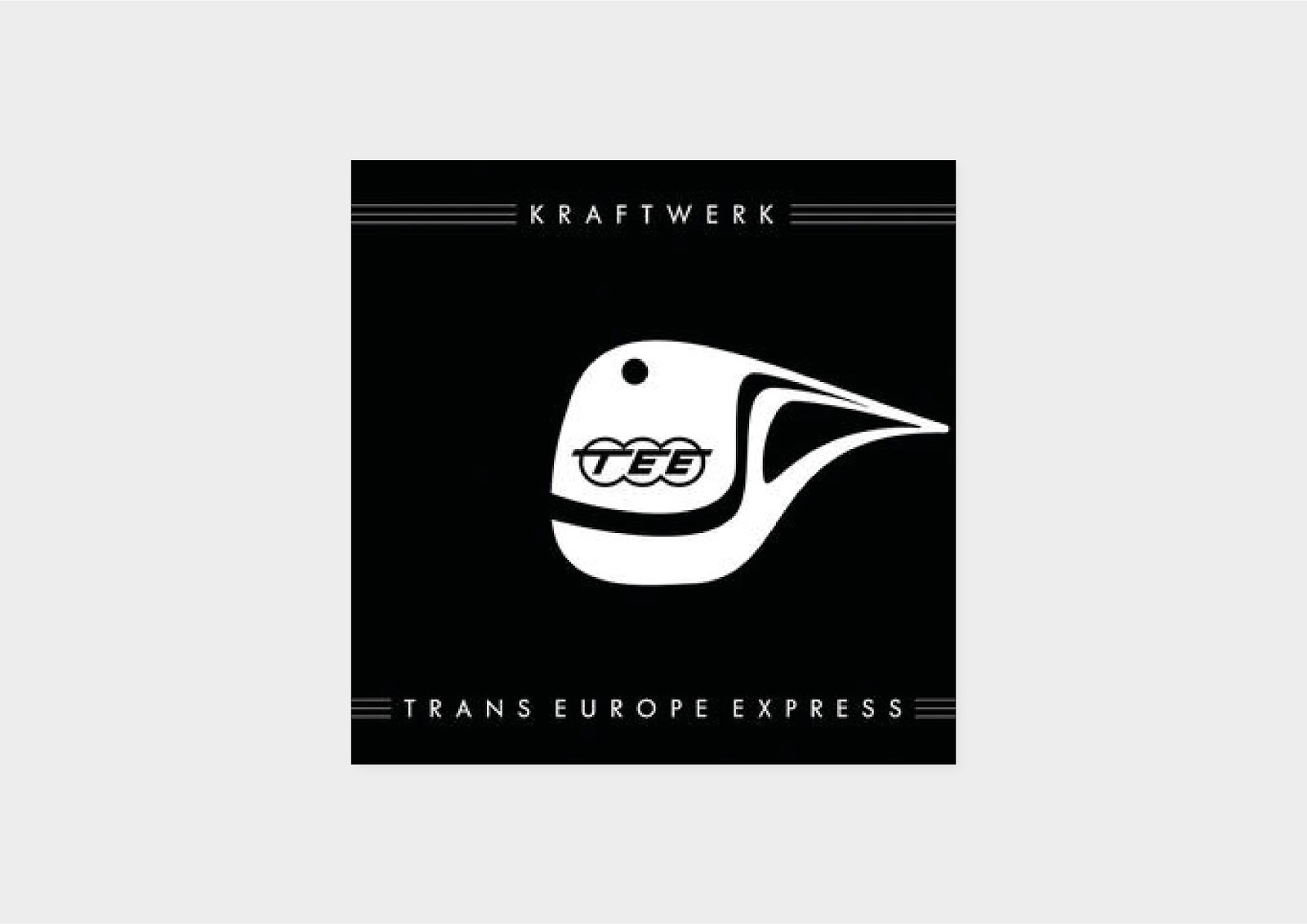
The artwork for the album cover of Trans-Europe Express was by New York based celebrity photographer Maurice Seymour and J.Stara with the group dressed in suits to resemble mannequins. From research for the essay I discovered the photography was aiming to replicate a style of the 30s. However, what I mainly like about the cover is the type treatment along with the lines which I believe symbolises lines and tracks of the Trans Europa Express. Maybe subtle additions which can have a association with the TEE will add detail to the redesign. In the 2009 remastered version of the cover, the artwork is changed to show a more clear relationship with the Trans Europa Express. A white illustration of a train in motion is shown, its a lot more simple but the type treatment style remains the same. For the redesign of Trans Europe Express I wanted to continue to express the Trans Europa Express but in a more elaborate manner and really celebrating what Kraftwerk were communicating.


For the first idea I visualised trains of today which contrast greatly to the TEE wagons of the 70s. I wanted something simple yet effective so deemed flat line vectors suitable, then I was inspired by the modernist Trans Europa Express posters I looked into in research. I examined the colours and layouts of the posters then took aspects from each design and applied them to the idea above. The decision to use yellow is influenced by the secondary colour of the TEE, I felt the bold red of the trains is too obvious to include in the designs. However, the yellow offers more flexibility for inclusion of other colours to be used. For the title I used a Space Mono, a personal favourite of mine but I deemed it necessary to use because of its retro-future aesthetic. Its been coined 'an everyday visitor from outer space' by Colophon Foundry and I can compare this to Kraftwerk and their aim of a utopian future as I discuss in the essay.
The layout of the title is unusual but one that can be portrayed as a an overhead line or overhead wire, which can be seen for the 'Europe' part. It may be ambiguous but I like the potential idea of it as the train is passing below it.
The body copy I used is Documan which is a semi-rounded typeface with typewriter look. Circle forms are punched into vertical stems and the terminals are diagonal. I like the tails and serifs of the typeface as they extend out like a line, similar to railway lines. The roundness of it, adds a warmth to the design.

I wanted something more complex for the track listing so used the concept of trains again and imagined each track as a stop on a journey on the TEE. Other little details include the addition of the TEE logo throughout the design.

The second ideas uses the same spine and panel designs but goes for a more minimal aesthetic portraying overlaying train lines.

The use of photography was introduced for this idea to give a more realistic idea of the TEE.

Duotone and type experimentation

My idea generation for the Autobahn influenced my approach for this ideas as I imagined train travel in 2018. The most common symbolisation of train travel I believe is the tickets, so I reworked one to suit the album. The green pattern says 'Kraftwerk' while the TEE logo replaces the National Rail logo. Although the ticket is National Rail, therefore its British but still the design has a worldwide symbolisation.

The final idea takes the lines from the original album and exaggerates them
No comments:
Post a Comment