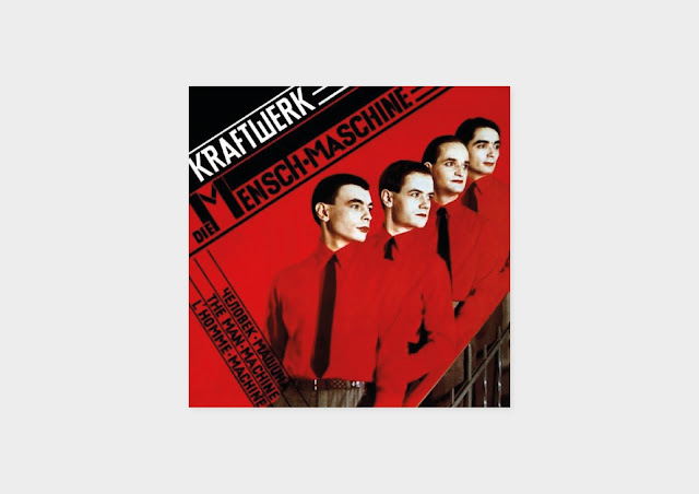
The design in The Man Machine is evidently paying homage to the Russian Constructivist art of the 1920s with cubist shapes and typography. The artist they referenced; El Lissitzky was a Jewish Russian Artist who was influential in the supremacist and constructivist movements that thrived following the Russian 1917 revolution. Furthermore he even went on to have an influential role in the Bauhaus movement. So for inspiration for this idea I looked at constructivist inspired design, rather than looking at pure constructivist art of the 20s. This is because I didn't want to be only replicating constructivism. Redesigning The Man Machine would be accomplished through geometry, colour, typography and indistinctive characteristics of constructivism that can be found in contemporary design today.
Constructivism was a total commitment to and acceptance of modernity. The art was typically totally abstract, with the emphasis on geometric shapes and experimentation. Therefore, for the first idea I wanted to take simple lines and create an illusion that was not emotional or subject in any way, so taking characteristics of constructivism and applying them subtly. Constructivism was all about universal forms, and this is most likely why Kraftwerk chose to appropriate it. So in the first response it was designed to be objective and open to anything.
I searched around for a number of constructivist related typefaces but they all had a Dafont look to them, in the sense they all fall under the Russian look category. With all them having a Soviet aesthetic which I felt was too overpowering for the design. Instead, I looked at bold, heavy and condensed sans serif typefaces which are similar to constructivist fonts but without the exaggerated slabs.
I experimented with a number of typefaces but decided upon Druk which is a study of extremes in typography, as it features the narrowest, widest, and heaviest typefaces. Starting from Medium and going up to Super, Druk is uncompromisingly bold. Druk was intentionally designed without a normal width, nor lighter than medium weights so it is ideal for The Man Machine which used a mix of sizes and shapes.
In the second idea I altered the type by making Druk italic for the content such as track titles and personnel. These little changes add extra character to the body copy while also paying homage to angled shapes and type of constructivism. The cover for the second idea introduces photography, which is a robot mannequin of Ralf Hütter, and this particularly image is similar to the image from The Man Machine in position and the gaze of the mannequin. I altered the image in illustrator by outlining the image with the iconic red of constructivism then masked the title in a layout influenced by the original.

This idea blends geometric shapes into a abstract form which is only left distinguishable by the red and black colours of constructivism.
I wanted to try create a minimal design with only lines and shapes to represent the music.
This design is the most influenced by constructivism by far as the shapes and lines create a structure that was built completely from experimentation.


No comments:
Post a Comment