Firstly I showed Autobahn because of the range of ideas I have for this album compared to the other two. This is because during development I felt I could arrange and alter the core ideas, such as the illustration of the motorway or the directional arrows in a number of ways. Overall people understood each idea and appreciated certain aspects like the use of Din, and its links to the German car industry and motorway travel. I was curious to know if maybe I'd overdone the motorway signage look with the arrows etc, but my peers believed it was subtle enough and achieved a fine line between actual motorway signage and the layout of any other track listing etc. One alteration a peer suggested was to maybe experiment with more colour for the Autobahn idea as all the ideas are all based of the original blue. Although I did consider changing the colour at times, I set out to use the original blue as I believe its such a significant expression of the album. I made additions with the the dark orange which can be found on road signage, so I felt this was the only colour which could be added to the white and blue colour scheme. In general people swayed towards the motorway illustration idea and the direction icons, but couldn't put a finger on either as I had a number of adaptions for each. Therefore, I decided to pick my personal favourites and take feedback on board and choose two potential finals then ask a wider audience which stood out more. I deemed Instagram story polls as a beneficial way of getting peoples opinions quickly and easily.

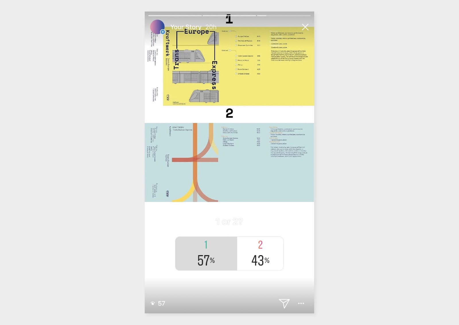
For Trans Europe Express some ideas went down well while others didn't. Some positive feedback included comments such as 'the illustrative train idea looks more contemporary and is influenced by something from the past like you've mentioned Kraftwerk were all about' this is referring to the idea of the train illustrations which was informed by the original TEE posters used to promote the service.
Peers also liked the ticket idea but thought it needed more detail, however for this idea I felt you can only add so much for the cover such as artist and album name. The colours of each design were well received, however the ideas including photography were deemed ineffective which I agreed on. From feedback and personal preference I felt I knew which idea was the strongest, but still I carried on by picking the two favourite ideas as a part of a poll to gain more reactions.
Before I showed my peers the final ideas for The Man Machine I felt my mind was already made up which one was my personal favourite. So I was hoping to receive some feedback to make me reconsider other options that may just need some altering to make them right. Additionally, I wanted to run what I learnt from constructivism past my peers so they understood my approach for The Man Machine. I emphasised that constructivism was a total commitment to and acceptance of modernity. The art was typically totally abstract, with a focus on geometric shapes and experimentation. And I explained I wanted to reinterpret a constructivist style for the cover, while still bearing in mind the originals overall style. From this explanation my peers felt two ideas put a new spin on the idea and that was the the one with the photography element and the idea with line panels which almost creates an illusion.

No comments:
Post a Comment