The design of the German edition cover shows a strange futuristic landscape; a motorway is portrayed, winding through a sunlit landscape. The band’s own VW Beetle is shown driving along the open road ahead. However, the British version is more bold, modern and iconic. Either way they both communicate the same concepts of motorway travel in Germany and car manufacturing among other things which I discuss in the essay.
What I wanted to take from the original covers is the iconic blue and white colour pallete from the British version which is inspired by road signage. I don't believe this album artwork would be as iconic or effective if it was a different set of colours. Therefore, using the iconic colours would help communicate the album without imitating, replicating, or distorting the original. Another huge aspect to take from this album is obviously the Autobahn itself, and the task is to reimagine it visually and to question what exactly it means today. And whether or not its necessary to use it, to communicate the same ideals of Kraftwerk's in the 70s about post war German identity.
Before I began designing for Autobahn I also looked into German road signage to inspire my ideas, so in the numerous ideas below you can see little details which are took from road/motorway signage in general such as direction arrows, colours of the autobahn, Din the typeface used in German road signage and common layouts found on signage etc.
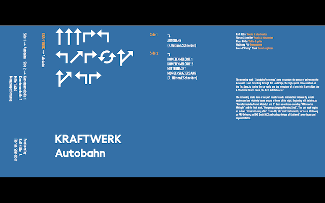
So for the first idea I established the panel and spine designs first which would accompany all the designs. The layout, colour and typography is heavily influenced by road signage, yet I wanted to put my own spin on the layouts as I didn't just want to replicate signage. The use of arrow glyphs helped this and offers a more contemporary feel to the artwork.
The use of Din is essential to helping communicate the Autobahn, therefore it can see on most ideas apart from a few. Din can be found on German road signage but also number plates which can signify the concept of car manufacturing in Germany which helped boost post war German identity and economy.
As one of main challenges of this redesign was to reimagine the Autobahn, I thought more about how to put a twist on the iconic symbol of the motorway. I wanted to keep a symbol of some sort for an idea, so I illustrated a motorway cross section which isn't obvious at first glance to what it exactly is. I believe the illustration shows the core of the Autobahn, and shows it for what it is. I argue in the essay that Autobahns are aesthetic monuments so I imagined it, as exactly that. It can come across as a monument statue of the motorway
For other ideas I focused more on the details of the album, such as the trip from Koln to Bonn on A555 which the music is all about.
Stepping away from Din for some ideas was to help offer some more type orientated ideas stand out, as I felt at times Din didn't work well enough on its own. In the idea above I continue to visually showcase the trip from Koln to Bonn but in a layout which can linked to road signage again.
For this idea I thought about other ways of communicating the Autobahn with the use of icons. In the original British version the motorway symbol/icon is iconic yet very literal. I wanted to challenge the symbolisation of the Autobahn and motorway travel today. Therefore, I thought about motorway travel today and the processes, icons, symbols and procedures you come across while travelling via car in 2018. I thought about whats changed in the world since the album came out, and I think the obvious difference is the internet and hows its intertwined in daily life. So from here I thought about the connection between the internet and motorway travel, and the outcome was Google Maps and how we use it to navigate in day to day life. Generally, today we use Google Maps in all manners whether thats walking, cycling, vehicle or train travel. So I used Google Maps to create a outcome using the icons which direct you from Koln to Bon via the A555.
The arrows are the exact directions you'd take to get to your location while other icons signify cities, car travel and starting point. I understood this idea was rather ambiguous so to accompany it, I used the step by step directions from Google Maps and placed them below the album synopsis.
Experimentation with different typefaces
I continued to use the concept of travel in 2018 and the symbolisation surrounding that. It can be seen above in a more literal and simplified manner.
The two ideas above consider the simplest of motions of the motorway, with the first showing two cars travelling in different directions passing in the form of typography. While the second is the link between Koln and Bonn showed in a map signage form.


No comments:
Post a Comment