When looking back on this module, I knew it would be stressful and demanding at times. However, by conducting research on electronic music I feel as though my passion for the subject has made this a more enjoyable module than I imagined. When finishing second year I knew I had to choose a subject that I'm passionate about to allow myself to push on into third year. And by focusing on electronic music it has allowed me to further my knowledge of the genre, as well as correlating it to my practice. Although, what I originally set out to achieve changed during this module, as at first I was focusing on the issue of 'noise' in electronic music and graphic design. I feel as though my extensive research in the early stages of the module allowed me to look past noise, while still using research I already found.
Instead on noise, I discovered the issue of appropriation in electronic music and how its pivotal in the culture. In the essay I showed a broad range of themes and topics linked to appropriation while managing to link each one correctly. Each subject point in the essay has further opened my eyes to the relationship between graphic design and electronic music, and its encouraged me to further this research past context of practice. Additionally, its opened up new paths of research I feel, such as the role of robots in electronic music? The research conducted on Kraftwerk and Warp Records enabled me to look past my initial intentions and brainstorm new ideas that maybe can showcase how robots are also so pivotal in electronic music.
My research definitely progressed but I feel maybe the inclusion of some interviews could have benefited the essay, as well as me. In terms of the practical outcome, I am very pleased with the work I have produced. One difference I've noticed this year is the quality in my practical work compared to other context of practice modules. In the past I've rushed the outcomes relating to the essay which doesn't create a well rounded project. Nonetheless, this time round I believe I've fixed this issue by conducting practical research and more development.
I'm also pleased with the correlation to the essay but how I think i've pushed this further and brought it into the present. The links to the essay are the three albums I analyse and the issue of appropriation and why Kraftwerk did this. However, for the practical I wanted to repurpose these albums for the modern day while still bearing in mind what Kraftwerk were aiming to achieve in the 70s. As a result, i've achieved this while always linking back to the key research from the essay about Kraftwerk.
On a personal level I also feel positive about this module as i've managed my time and workflow. The booking of print slots and photography studios has given me individual deadlines to work towards and also allowed me back up options as I tried to hit personal deadlines early.
Sunday, 21 January 2018
OUGD601 - Practical synergy
The essay asks the question 'How does graphic design interpret electronic music culture?' and throughout the study, research shows how appropriation is crucial in allowing graphic design show the worth electronic music has beyond its function. It is evident that electronic music relies heavily on appropriation, and in turn it allows electronic music to continuously move forward and evolve.
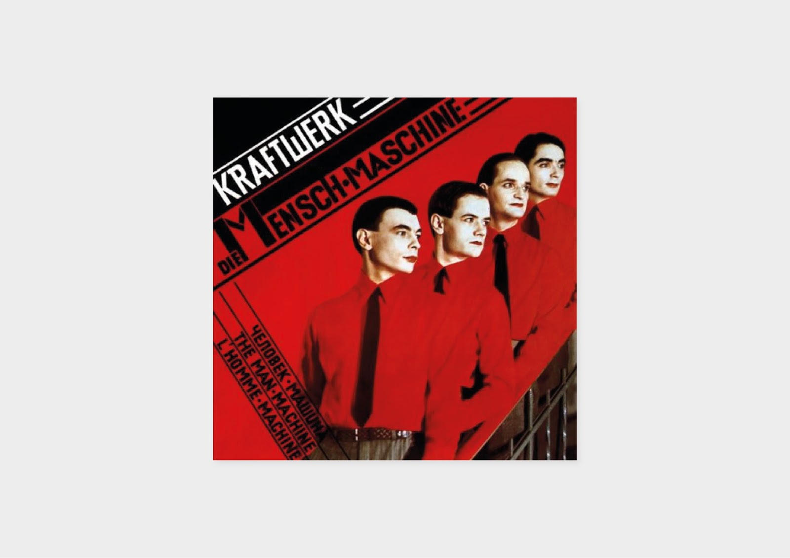
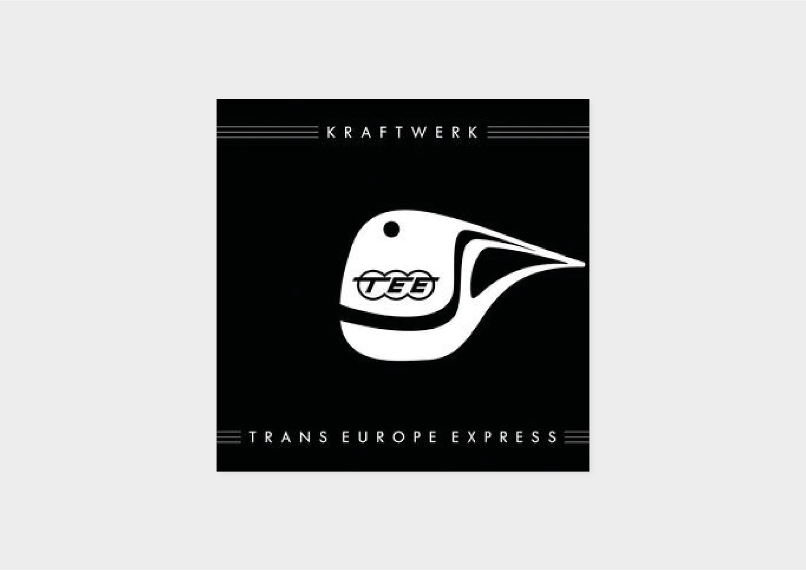
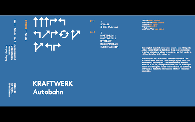
In chapter one in the essay I discuss the visual culture of Kraftwerk including the highly original and influential albums Autobahn, Trans Europe Express and The Man Machine. This particular investigation focuses on the album packaging which was produced with the same attention to detail as the music. From this investigation it shows why Kraftwerk used appropriation, as it was to prompt a better future, and change perceptions of German identity following the war. They achieved this by appropriating imagery from the cultures of the 20s, 30s and 40s; in a nostalgic manner yet prompting a promise of a better utopian future. It was a concept that ‘aims to fuse utopian notions with nostalgic images to create an aesthetic tension that confronts the present’ (Poynor, 2003). It can be seen in Autobahn with the confrontation of Hitler’s ‘prioritised project’ to maybe show an era of social transformation following the war. Even more so in The Man Machine, with Kraftwerk’s retrieval of Lissitzky as he had once reflected utopian desires and futuristic anticipations.
It allowed Kraftwerk to use historical alternatives which contrasted to the modernist models which were dominating the industry at the time. As a result, Kraftwerk stood out musically and aesthetically.
Therefore, for my practical I wanted to use this concept of fusing utopian notions with nostalgic images to create tension which subsequently creates aesthetic tension in the present. However, for my practical I wanted to reimagine Kraftwerk in the 'present'. So in my practical you can see I appropriate the same themes such as the autobahn, Trans Europa Express and constructivism. Yet in styles more appropriate for today while still rejecting the modernist models that exist in today, just as Kraftwerk did in the 70s.
I believe I achieve this through the use of tape cassettes and overall aesthetic of the covers. Firstly,
the tapes which can be considered a nostalgic medium of music today. Additionally, tape production in music today has a collectors item tag associated with it, whoever purchases the tape obviously appreciates the music but also the packaging with it. It is considered rare and a piece of music to be cherished unlike a file stored on a streaming service. It can also be argued that tapes may have a surge like vinyl has had in recent years, and the practical questions if Kraftwerk would be ahead of the curve if they were releasing tape music today.
Secondly, the design of the covers differ to most techno albums of today which mostly adorn an image of the artist in ambiguous manner. I wanted each cover to tell the story of the original while not replicating, distorting or imitating it. I feel all the themes are appropriated in nostalgic manners while imagining each niche theme in todays world.
Wednesday, 17 January 2018
OUGD601 - Final images
As I was able to print early I was also able to grab a slot to capture the work in a photography studio on the 16 January. For the images of the tapes I wanted them simple and clean with no props etc accompanying them. This would help the covers speak for the music alone and focus the attention on the unusual medium of the music. The final edited images can be seen below.


OUGD601 - Production of final designs
Once the final designs were finalised I undertook a test print of the covers and stickers. Using 90 gsm cartridge paper for both, this test was to see if the measurements were right as well seeing how the covers and stickers would work together.

The test prints were a success with measurements for both stickers and covers being correct. The print quality from the studios printer was satisfactory, even to the quality where these prints could even be a final piece. With the only issue being the layout when you print double sided always seems to be wrong. I creased each fold by hand for the tests as they were only 90 gsm but for the final prints I planned to use the folding machine in the digital print room.
I pre booked a print slot before Christmas for the 18th January but as I was ahead of schedule I was eager to get the final prints done early, then if any changes needed to be made I could correct them at the original print slot. Luckily enough I was able to use a peers print slot which they unable to attend on the 12th January. Before I printed I examined a number of stocks in the print room and compared them to a cassette cover example I had on me, and the common weight seems to be 120 gsm so I went with a 120 gsm stock with a smooth finish. For the cassette stickers I used a matte finish sticker, which did slightly change the colours but I discussed this with James and nothing could be done.

Once the printing was complete I made measurements of the folds in the covers, but only for me to realise the fold measurements were too small for the folding machine which is predominately meant for zines. Therefore, I had to fold by using a ruler and making sure each fold was precise. Another issue that arisen was when I trimmed the artwork, and discovered the artwork one side wasn't centred. Meaning the trimming would affect one sides bleed more than the other. This issue has happened before when printing double sided and occurs when the paper sizes are different by the slightest of measurements. This problem was out of my hand and luckily it isn't that noticeable on the covers, with only The Man Machine cover being detectable. The issue can be seen below.

OUGD601 - Final designs
Following feedback and additional development I made my decision regarding the final designs of the tape covers. When looking back at the original research of the essay and what I intentionally set out to do, I felt that the responses I chose were most suitable to the original ideas. As they don't imitate, replicate or distort in any way.

The final idea for Autobahn is heavily inspired from a piece of research in my essay about Hitlers view on his prioritised project. I discovered that it was claimed ‘Hitler regarded these highways above all as aesthetic monuments’ (Albiez and Pattie, 2011) Therefore, for this idea I literally wanted to reimagine the graphic on the cover as a aesthetic monument. This comes in the form of a highway line illustration with polka dot detail . It shows the foundations as well as the road surface to show the scale of the Autobahn.
I added little details like the A555 Autobahn sign to the spine which is an obvious influence from motorway/highway visual culture. Additionally, smaller details can be portrayed in the cover as I wanted the album title and artist title to visualise some sort of motion. I aimed to use the straight line between 'Autobahn' and 'Kraftwerk' as a motorway barrier separating two directions of traffic, with 'Kraftwerk' going in one direction while 'Autobahn' goes in another.
For Autobahn I decided to not design a flip side, as the tracks dont have any lyrics unlike the other two albums. So to design a flip side for the cover, would be pointless as I couldn't think of anymore content to add.

The sticker designs for each cassette are using a template I found online which is suitbale for the tapes I have for the project.
For the sticker design I wanted something simple while still carrying on the signage style. I continued to look at German road signage to influence the design and liked the idea of using an arrowed shape for the stickers to help fill a awkward space.


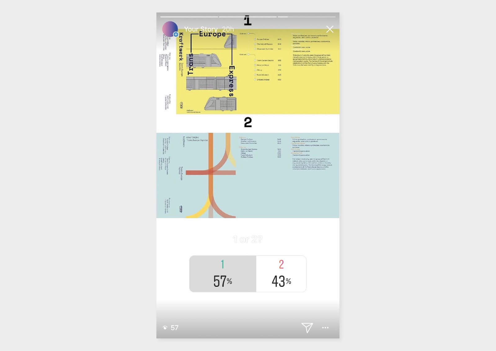
The final Trans Europe Express idea is heavily inspired by the railways advertising artwork from mainly the 70s. I looked into the artwork earlier on in research and found the work inspiring, some of its typically Swiss but others represent current styles of each country the TEE operated in. Each artwork always included a TEE wagon so this had to be key element of the design, along with choosing a suitable colour which related back to the TEE, which is the yellow used which worked alongside red on the TEE wagons.
One alteration I made is the change of white type to blue, as the 6pt white type contrasted to the vibrant yellow which made it illegible.
The flip side of the cover includes all the songs lyrics along with the tracks producers. In the left over space I decided to further celebrate the TEE by having a selection of images showcasing the service, along with small descriptions.

The cassette sticker is straightforward and minimal, as I don't believe it needed anymore added detail as the cover alone is complex.

I chose this idea as it combines photography and angled typography, similar to the original cover.
Additionally, I also feel this idea embraces constructivist features although it is more contemporary and doesn't direct its focus simply on geometric shapes and soviet inspired typography.
I also like the image I used which was gathered from a Guardian interview with Ralf Hutter in research. The image is clearly a mannequin figure which furthers the albums concept of whether or not technology has left us a little bit man machine. Even more so, the original The Man Machine cover contrasted to the other albums aesthetically. So this is another reason I felt the need to use an idea with a difference to the others. In contrast, to this the TEE and Autobahn covers step away from pictures that normally adorn techno albums today.

The stickers use the typographical treatment from the cover as a pattern.

The final idea for Autobahn is heavily inspired from a piece of research in my essay about Hitlers view on his prioritised project. I discovered that it was claimed ‘Hitler regarded these highways above all as aesthetic monuments’ (Albiez and Pattie, 2011) Therefore, for this idea I literally wanted to reimagine the graphic on the cover as a aesthetic monument. This comes in the form of a highway line illustration with polka dot detail . It shows the foundations as well as the road surface to show the scale of the Autobahn.
I added little details like the A555 Autobahn sign to the spine which is an obvious influence from motorway/highway visual culture. Additionally, smaller details can be portrayed in the cover as I wanted the album title and artist title to visualise some sort of motion. I aimed to use the straight line between 'Autobahn' and 'Kraftwerk' as a motorway barrier separating two directions of traffic, with 'Kraftwerk' going in one direction while 'Autobahn' goes in another.
For Autobahn I decided to not design a flip side, as the tracks dont have any lyrics unlike the other two albums. So to design a flip side for the cover, would be pointless as I couldn't think of anymore content to add.

The sticker designs for each cassette are using a template I found online which is suitbale for the tapes I have for the project.
For the sticker design I wanted something simple while still carrying on the signage style. I continued to look at German road signage to influence the design and liked the idea of using an arrowed shape for the stickers to help fill a awkward space.


The final Trans Europe Express idea is heavily inspired by the railways advertising artwork from mainly the 70s. I looked into the artwork earlier on in research and found the work inspiring, some of its typically Swiss but others represent current styles of each country the TEE operated in. Each artwork always included a TEE wagon so this had to be key element of the design, along with choosing a suitable colour which related back to the TEE, which is the yellow used which worked alongside red on the TEE wagons.
One alteration I made is the change of white type to blue, as the 6pt white type contrasted to the vibrant yellow which made it illegible.
The flip side of the cover includes all the songs lyrics along with the tracks producers. In the left over space I decided to further celebrate the TEE by having a selection of images showcasing the service, along with small descriptions.

The cassette sticker is straightforward and minimal, as I don't believe it needed anymore added detail as the cover alone is complex.

Additionally, I also feel this idea embraces constructivist features although it is more contemporary and doesn't direct its focus simply on geometric shapes and soviet inspired typography.
I also like the image I used which was gathered from a Guardian interview with Ralf Hutter in research. The image is clearly a mannequin figure which furthers the albums concept of whether or not technology has left us a little bit man machine. Even more so, the original The Man Machine cover contrasted to the other albums aesthetically. So this is another reason I felt the need to use an idea with a difference to the others. In contrast, to this the TEE and Autobahn covers step away from pictures that normally adorn techno albums today.
The flip side cover features all tracks and lyrics, then the typographical treatment is more informed by angled lines and type of constructivism by angling a key line from the track 'The Man Machine'.

Sunday, 14 January 2018
OUGD601 - Practical feedback
After I did numerous ideas for each album I wanted general feedback on the designs, and whether or not they communicate Kraftwerk's concepts and their music. So I then went onto explaining the reasoning behind each idea and the albums original ideas to a group of peers during a practical feedback session. I really just wanted to see which ideas stood out instantly on a aesthetic level before they looked more into the decisions behind certain details.
Firstly I showed Autobahn because of the range of ideas I have for this album compared to the other two. This is because during development I felt I could arrange and alter the core ideas, such as the illustration of the motorway or the directional arrows in a number of ways. Overall people understood each idea and appreciated certain aspects like the use of Din, and its links to the German car industry and motorway travel. I was curious to know if maybe I'd overdone the motorway signage look with the arrows etc, but my peers believed it was subtle enough and achieved a fine line between actual motorway signage and the layout of any other track listing etc. One alteration a peer suggested was to maybe experiment with more colour for the Autobahn idea as all the ideas are all based of the original blue. Although I did consider changing the colour at times, I set out to use the original blue as I believe its such a significant expression of the album. I made additions with the the dark orange which can be found on road signage, so I felt this was the only colour which could be added to the white and blue colour scheme. In general people swayed towards the motorway illustration idea and the direction icons, but couldn't put a finger on either as I had a number of adaptions for each. Therefore, I decided to pick my personal favourites and take feedback on board and choose two potential finals then ask a wider audience which stood out more. I deemed Instagram story polls as a beneficial way of getting peoples opinions quickly and easily.


Firstly I showed Autobahn because of the range of ideas I have for this album compared to the other two. This is because during development I felt I could arrange and alter the core ideas, such as the illustration of the motorway or the directional arrows in a number of ways. Overall people understood each idea and appreciated certain aspects like the use of Din, and its links to the German car industry and motorway travel. I was curious to know if maybe I'd overdone the motorway signage look with the arrows etc, but my peers believed it was subtle enough and achieved a fine line between actual motorway signage and the layout of any other track listing etc. One alteration a peer suggested was to maybe experiment with more colour for the Autobahn idea as all the ideas are all based of the original blue. Although I did consider changing the colour at times, I set out to use the original blue as I believe its such a significant expression of the album. I made additions with the the dark orange which can be found on road signage, so I felt this was the only colour which could be added to the white and blue colour scheme. In general people swayed towards the motorway illustration idea and the direction icons, but couldn't put a finger on either as I had a number of adaptions for each. Therefore, I decided to pick my personal favourites and take feedback on board and choose two potential finals then ask a wider audience which stood out more. I deemed Instagram story polls as a beneficial way of getting peoples opinions quickly and easily.

For Trans Europe Express some ideas went down well while others didn't. Some positive feedback included comments such as 'the illustrative train idea looks more contemporary and is influenced by something from the past like you've mentioned Kraftwerk were all about' this is referring to the idea of the train illustrations which was informed by the original TEE posters used to promote the service.
Peers also liked the ticket idea but thought it needed more detail, however for this idea I felt you can only add so much for the cover such as artist and album name. The colours of each design were well received, however the ideas including photography were deemed ineffective which I agreed on. From feedback and personal preference I felt I knew which idea was the strongest, but still I carried on by picking the two favourite ideas as a part of a poll to gain more reactions.
Before I showed my peers the final ideas for The Man Machine I felt my mind was already made up which one was my personal favourite. So I was hoping to receive some feedback to make me reconsider other options that may just need some altering to make them right. Additionally, I wanted to run what I learnt from constructivism past my peers so they understood my approach for The Man Machine. I emphasised that constructivism was a total commitment to and acceptance of modernity. The art was typically totally abstract, with a focus on geometric shapes and experimentation. And I explained I wanted to reinterpret a constructivist style for the cover, while still bearing in mind the originals overall style. From this explanation my peers felt two ideas put a new spin on the idea and that was the the one with the photography element and the idea with line panels which almost creates an illusion.

Friday, 12 January 2018
OUGD601 - Production - The Man Machine redesign
The design in The Man Machine is evidently paying homage to the Russian Constructivist art of the 1920s with cubist shapes and typography. The artist they referenced; El Lissitzky was a Jewish Russian Artist who was influential in the supremacist and constructivist movements that thrived following the Russian 1917 revolution. Furthermore he even went on to have an influential role in the Bauhaus movement. So for inspiration for this idea I looked at constructivist inspired design, rather than looking at pure constructivist art of the 20s. This is because I didn't want to be only replicating constructivism. Redesigning The Man Machine would be accomplished through geometry, colour, typography and indistinctive characteristics of constructivism that can be found in contemporary design today.

Constructivism was a total commitment to and acceptance of modernity. The art was typically totally abstract, with the emphasis on geometric shapes and experimentation. Therefore, for the first idea I wanted to take simple lines and create an illusion that was not emotional or subject in any way, so taking characteristics of constructivism and applying them subtly. Constructivism was all about universal forms, and this is most likely why Kraftwerk chose to appropriate it. So in the first response it was designed to be objective and open to anything.
I searched around for a number of constructivist related typefaces but they all had a Dafont look to them, in the sense they all fall under the Russian look category. With all them having a Soviet aesthetic which I felt was too overpowering for the design. Instead, I looked at bold, heavy and condensed sans serif typefaces which are similar to constructivist fonts but without the exaggerated slabs.
I experimented with a number of typefaces but decided upon Druk which is a study of extremes in typography, as it features the narrowest, widest, and heaviest typefaces. Starting from Medium and going up to Super, Druk is uncompromisingly bold. Druk was intentionally designed without a normal width, nor lighter than medium weights so it is ideal for The Man Machine which used a mix of sizes and shapes.

In the second idea I altered the type by making Druk italic for the content such as track titles and personnel. These little changes add extra character to the body copy while also paying homage to angled shapes and type of constructivism. The cover for the second idea introduces photography, which is a robot mannequin of Ralf Hütter, and this particularly image is similar to the image from The Man Machine in position and the gaze of the mannequin. I altered the image in illustrator by outlining the image with the iconic red of constructivism then masked the title in a layout influenced by the original.

This idea blends geometric shapes into a abstract form which is only left distinguishable by the red and black colours of constructivism.

I wanted to try create a minimal design with only lines and shapes to represent the music.

This design is the most influenced by constructivism by far as the shapes and lines create a structure that was built completely from experimentation.
OUGD601 - Production - Trans Europe Express redesign
The artwork for the album cover of Trans-Europe Express was by New York based celebrity photographer Maurice Seymour and J.Stara with the group dressed in suits to resemble mannequins. From research for the essay I discovered the photography was aiming to replicate a style of the 30s. However, what I mainly like about the cover is the type treatment along with the lines which I believe symbolises lines and tracks of the Trans Europa Express. Maybe subtle additions which can have a association with the TEE will add detail to the redesign. In the 2009 remastered version of the cover, the artwork is changed to show a more clear relationship with the Trans Europa Express. A white illustration of a train in motion is shown, its a lot more simple but the type treatment style remains the same. For the redesign of Trans Europe Express I wanted to continue to express the Trans Europa Express but in a more elaborate manner and really celebrating what Kraftwerk were communicating.


For the first idea I visualised trains of today which contrast greatly to the TEE wagons of the 70s. I wanted something simple yet effective so deemed flat line vectors suitable, then I was inspired by the modernist Trans Europa Express posters I looked into in research. I examined the colours and layouts of the posters then took aspects from each design and applied them to the idea above. The decision to use yellow is influenced by the secondary colour of the TEE, I felt the bold red of the trains is too obvious to include in the designs. However, the yellow offers more flexibility for inclusion of other colours to be used. For the title I used a Space Mono, a personal favourite of mine but I deemed it necessary to use because of its retro-future aesthetic. Its been coined 'an everyday visitor from outer space' by Colophon Foundry and I can compare this to Kraftwerk and their aim of a utopian future as I discuss in the essay.
The layout of the title is unusual but one that can be portrayed as a an overhead line or overhead wire, which can be seen for the 'Europe' part. It may be ambiguous but I like the potential idea of it as the train is passing below it.
The body copy I used is Documan which is a semi-rounded typeface with typewriter look. Circle forms are punched into vertical stems and the terminals are diagonal. I like the tails and serifs of the typeface as they extend out like a line, similar to railway lines. The roundness of it, adds a warmth to the design.

I wanted something more complex for the track listing so used the concept of trains again and imagined each track as a stop on a journey on the TEE. Other little details include the addition of the TEE logo throughout the design.

The second ideas uses the same spine and panel designs but goes for a more minimal aesthetic portraying overlaying train lines.

The use of photography was introduced for this idea to give a more realistic idea of the TEE.

Duotone and type experimentation

My idea generation for the Autobahn influenced my approach for this ideas as I imagined train travel in 2018. The most common symbolisation of train travel I believe is the tickets, so I reworked one to suit the album. The green pattern says 'Kraftwerk' while the TEE logo replaces the National Rail logo. Although the ticket is National Rail, therefore its British but still the design has a worldwide symbolisation.

The final idea takes the lines from the original album and exaggerates them
Thursday, 11 January 2018
OUGD601 - Production - Autobahn redesign
I decided before I began redesigning each cover that I should analysis the original cover in more depth to aim to not imitate, replicate, or distort the original. This further research allowed me to look at the characteristics of each album so I knew what to consider and so on.
The design of the German edition cover shows a strange futuristic landscape; a motorway is portrayed, winding through a sunlit landscape. The band’s own VW Beetle is shown driving along the open road ahead. However, the British version is more bold, modern and iconic. Either way they both communicate the same concepts of motorway travel in Germany and car manufacturing among other things which I discuss in the essay.
What I wanted to take from the original covers is the iconic blue and white colour pallete from the British version which is inspired by road signage. I don't believe this album artwork would be as iconic or effective if it was a different set of colours. Therefore, using the iconic colours would help communicate the album without imitating, replicating, or distorting the original. Another huge aspect to take from this album is obviously the Autobahn itself, and the task is to reimagine it visually and to question what exactly it means today. And whether or not its necessary to use it, to communicate the same ideals of Kraftwerk's in the 70s about post war German identity.

Before I began designing for Autobahn I also looked into German road signage to inspire my ideas, so in the numerous ideas below you can see little details which are took from road/motorway signage in general such as direction arrows, colours of the autobahn, Din the typeface used in German road signage and common layouts found on signage etc.

So for the first idea I established the panel and spine designs first which would accompany all the designs. The layout, colour and typography is heavily influenced by road signage, yet I wanted to put my own spin on the layouts as I didn't just want to replicate signage. The use of arrow glyphs helped this and offers a more contemporary feel to the artwork.

The use of Din is essential to helping communicate the Autobahn, therefore it can see on most ideas apart from a few. Din can be found on German road signage but also number plates which can signify the concept of car manufacturing in Germany which helped boost post war German identity and economy.
As one of main challenges of this redesign was to reimagine the Autobahn, I thought more about how to put a twist on the iconic symbol of the motorway. I wanted to keep a symbol of some sort for an idea, so I illustrated a motorway cross section which isn't obvious at first glance to what it exactly is. I believe the illustration shows the core of the Autobahn, and shows it for what it is. I argue in the essay that Autobahns are aesthetic monuments so I imagined it, as exactly that. It can come across as a monument statue of the motorway

For other ideas I focused more on the details of the album, such as the trip from Koln to Bonn on A555 which the music is all about.

Stepping away from Din for some ideas was to help offer some more type orientated ideas stand out, as I felt at times Din didn't work well enough on its own. In the idea above I continue to visually showcase the trip from Koln to Bonn but in a layout which can linked to road signage again.

For this idea I thought about other ways of communicating the Autobahn with the use of icons. In the original British version the motorway symbol/icon is iconic yet very literal. I wanted to challenge the symbolisation of the Autobahn and motorway travel today. Therefore, I thought about motorway travel today and the processes, icons, symbols and procedures you come across while travelling via car in 2018. I thought about whats changed in the world since the album came out, and I think the obvious difference is the internet and hows its intertwined in daily life. So from here I thought about the connection between the internet and motorway travel, and the outcome was Google Maps and how we use it to navigate in day to day life. Generally, today we use Google Maps in all manners whether thats walking, cycling, vehicle or train travel. So I used Google Maps to create a outcome using the icons which direct you from Koln to Bon via the A555.
The arrows are the exact directions you'd take to get to your location while other icons signify cities, car travel and starting point. I understood this idea was rather ambiguous so to accompany it, I used the step by step directions from Google Maps and placed them below the album synopsis.


Experimentation with different typefaces


I continued to use the concept of travel in 2018 and the symbolisation surrounding that. It can be seen above in a more literal and simplified manner.


The two ideas above consider the simplest of motions of the motorway, with the first showing two cars travelling in different directions passing in the form of typography. While the second is the link between Koln and Bonn showed in a map signage form.
OUGD601 - Tape cassete production
Following research and feedback I decided tape cassettes would be the most appropriate medium to visualise and present the music, as if Kraftwerk were releasing the music today. Additionally, I feel as though tapes link to my research in the essay about Warp Records, and how I discovered further in practical research that they release ultra rare tapes.
Tape cassettes offer more of an opportunity for design too, as floppy disks are constricted in space.
As before online music cultures such as Spotify, record sleeves and cassette cases were an all-important canvas for communicating the vibe of an album or single. Cassettes and vinyl act as an outlet for a band’s aesthetic tastes and product design prowess, giving consumers something physical to cherish at a time when unique album art and liner notes have become obsolete.
Therefore, for inspiration I looked into examples of tapes today which caught my eye due to contemporary design.

I looked into a number of articles talking about the tape revival etc, what I found interesting and useful can be seen below:
An interview with Stuart Coupe
So what's driving the drift back to cassettes?
"I just think it's an object and people love objects," author and music journalist Stuart Coupe said.
"And I think that's a big part of why vinyl has become so popular again.
"There was something romantic about the cassette that you would give it to someone and go 'This is my favourite, these are the songs'.
"I'm sure a lot of romances started by boy-gives-girl, girl-gives-boy, boy-gives-boy, girl-gives-girl a cassette selection of their favourite tunes."
But he cannot see a lasting revival for the cassette tape despite its charming idiosyncrasies.
"If the cassette revival takes off it will be a boon for people who manufacture pencils, because a pencil was the one thing you had to have nearby with cassettes in case they started to unwind and go everywhere," he said.
I also looked at the resurgence of tapes through sales and discovered vinyl has helped bring cassettes back, seen here:
The resurgence of vinyl has been a centerpiece of the physical media story for years now, but records aren’t the only format that’s steadily rising back to relevance. Cassette tapes, a majority of which are sold online in direct-to-consumer settings, are experiencing a bit of a comeback, according to Nielsen’s year-end music report. In 2016, cassette sales rose 74 percent, to 129,000 units. That’s a paltry amount when compared to vinyl’s 13.1 million unit sales, and the declining CD market still notched 105 million units. Yet similar to vinyl, a cassette sale bump represents a healthier appetite for physical goods only playable on now-vintage hardware.
I noticed from looking at tapes that space for artwork isn't constricted to just the front cover. Once you take the cover out the cassette box, it can unfold into numerous panels which can help further communicate the album and its concept. This space can include track titles, lyrics and album synopsis etc. The space for front cover artwork is more narrow compared to vinyl and CD, so normally the original artwork from vinyl would be squared on the tape cover. However, I prefer the constricted space of tape covers which measure out at 64x100mm.
Now that I was decided upon using tapes as the medium to present the music, I had to prepare for the production of the artwork to accompany the cassettes. Luckily enough I was given some cassettes for free which are Maxell UR90 Audio Cassettes, then from here I decided upon a cassette cover style. I was surprised at how many different styles of covers you can fit into such a small case, with the maximum size potentially being 8 panels. For this process I looked into old cassette covers belonging to friends and family, to see the most frequently used and best suitable to my idea. I had to bear in mind how much content can actually accompany the music, so I decided to include cover, track titles, album synopsis and lyrics depending on album. This led to me considering two options which can be seen below:


I decided to use the J-Card with 2 extra panels as it offers more flexibility for content, and due to it having more flexibility for content then I feel it has more of a zine-like feel to add a bit of warmth into the visual language of the album. If the user and listener can do a number of things with the music before actually listening to it, such as reading the lyrics then I assume it creates more enthusiasm and engagment.

Indesign template for cover design
Subscribe to:
Comments (Atom)