OUGD501 - Studio brief 02 - Practical research
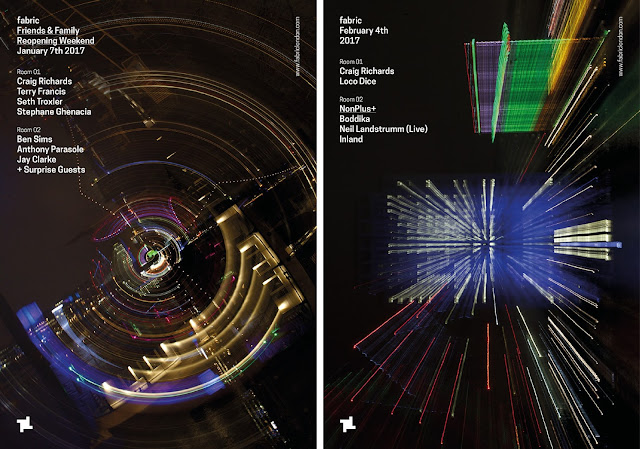
For this research I looked more broadly at graphic design that is relevant to the points made in my essay. For example Fabric' reopening campaign, Utopia identity which is influenced by rave, Printworks London identity and Diagonal Records.
As I discuss in my essay about the importance of Fabric's visual identity and how potentially graphic design saved the club. And obviously support of music lovers globally and London’s mayor Sadiq Khan, it was announced last November that the club’s #savefabric campaign had been successful. With the reopening announced it wad down to Roberto Rosolin, to create artwork which personifies the club’s persona through design. For its reopening, Roberto created a campaign entitled, Reconnection. The series of images and poster display the club’s melodic connection with London through photography. The photographs showcase London’s lively night landscape, featuring recognisable landmarks including the London Eye, the Michael Faraday Memorial in Elephant and Castle and Tate Modern. This another example of club nights and clubs being personified through graphic design which is an initial idea for the practical.
I found an example of an identity being influenced by rave culture, Utopia 2016 which was a year-long season at Somerset House that marked 500 years since the publication of Thomas More’s text of the same name. The visual identity had a rave-style smiley face icon, the word utopia can have a number of meanings but the smiley face references rave and acid house. The studio behind the concept wanted the identity be familiar and positive, with the use of the smiley face and a garish colour palette which is also influenced by rave culture; helping the identity being positive.
Very recently Leeds based studio Only designed the new identity for Printworks London, this new identity relates to one of my ideas of nightclub promotion but also the essay point of reaching out to audiences through design. It's a very clever identity, with it taking inspiration from the venue’s former purpose as the largest printing facility in Europe, the design uses icons of this history to form a bold and adaptable visual framework. This is a great source of inspiration for the nightclub promotion idea as the colours alone used in Printworks identity are clearly informed by the music. To be specific to a music genre, techno is often associated with the colour black and seen as Printworks will mainly be hosting techno nights it seems relevant to have a restrictive black and white palette.


No comments:
Post a Comment